See more details in the component grid
When you open the Components tab, only a few columns are displayed by default: Name and Type. If you want to see more details in the grid, you can add more columns, such as Followed by, Word count, and Updated date.
 Inspire remembers how you customize the column display. The next time you open the Components tab, Inspire uses your choices instead of the default. If you want Inspire to forget your customization and return to showing the default columns, you must clear your browser's cache.

What details do you want to see?
- Use default column headings to see details about a component.
- Customize the details by selecting from the Columns list.
- Understand the icons shown in the grid.
Use default column headings
Tips and tricks
- Only the Type column can be hidden. All other columns will always be shown.
- You can sort the grid by any column except the Attachment column (Column 5).
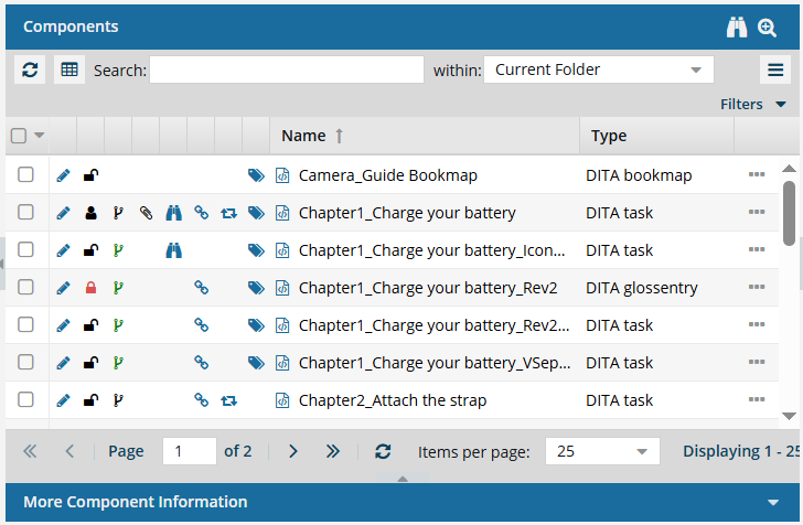
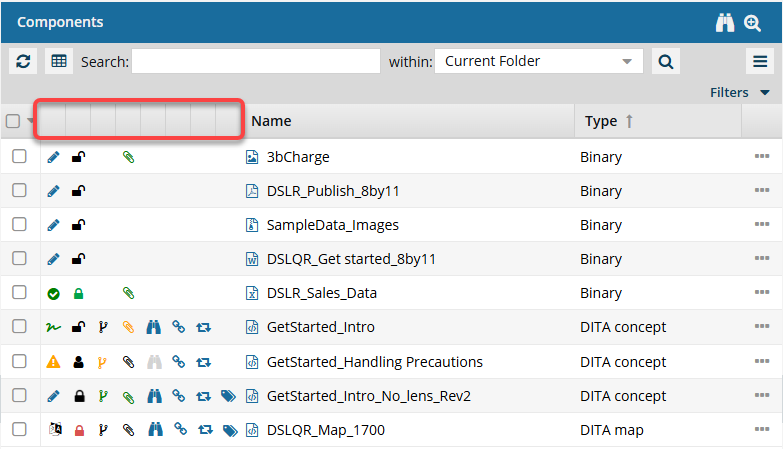
By default, you see the following information about a component:
 To see more details about an icon, refer to Understand the icons.
- Column 1: If it is selected or not. (
 )
) - Column 2: The State of the content in terms of writing drafts, validating XML, approving, signing, and translating. (
 ,
, 
 ,
,  ,
,  ).
). - Column 3: The Lock conditions shown as unlocked, locked by another user, locked by you, locked by the system (usually for reviews), and locked for translation. (
 ,
,  ,
,  ,
,  ,
,  )
) - Column 4: The Branch status, showing if the component has a relationship with other components as the source of a branch, is part of a branch, or is both. (
 ,
,  ,
,  )
) - Column 5: The Attachments, if any, as listed on the Component Details screen. Icons indicate whether there is an attachment, whether this component is an attachment for another component, or both. (
 ,
,  ,
,  )
) - Column 6: The Followed status, showing whether you or another Inspire user has signed up to receive a notification when another user deletes or updates the component. (
 ,
,  )
) - Column 7: The Referenced status and number of other components that reference this component. If it isn't referenced, you see no icon. If it is, to see the number, hover your cursor over the icon. A component is only counted once, even if it includes multiple references to this component. (
 )
) - Column 8: The Shared status and number of references in Inspire. If it isn't shared, you see no icon. To see the number, hover your cursor over the icon. All references are counted, even if one component references this component multiple times. (
 )
) - Column 9: The Tags status indicates whether at least one component tag has been added to a component's Inspire-based metadata. To see a list of all tags applied, hover your cursor over the tag icon. (
 )
) - Column 10: A File icon to help you distinguish between structured components and binary, you see an icon for an XML file, image, PDF, Microsoft Word, Microsoft Excel, and a ZIP archive. (
 ,
, ,
,  ,
, ,
, ,
, )
) - Column 11: Name shows the File Name without the GUID. This Name does not have to match the Title in the XML topic itself. You cannot hide this column.
- Column 12: The Type label tells you the structure of the content that matches its purpose. For example, DITA concept and DITA task topics use different required structures and different XML elements, even though both are written in XML. You can hide this column.
- Column 13: The Options menu tells you what actions you can take on the component. (
 ) For more details, refer to: Open the Options menu in the Components browser.
Customize the details
Not all details about a component are shown in the grid by default. You can customize the details you see by selecting which columns to show or hide.
To add a column that isn't shown by default:
- Put your cursor in the column heading row and hover over the name of the column.
- At the end of the column's title, click
 the down arrow and select Columns.
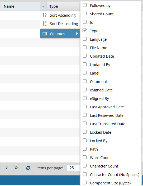
- Select the checkbox for the column you want to see in the Components browser's grid.
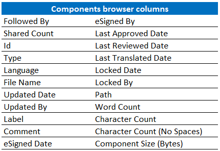
Followed By
Shared Count
Id
- Type
Language
File Name
Updated Date
Updated By
Label
Comment
eSigned Date
- eSigned By
Last Approved Date
Last Reviewed Date
Last Translated Date
Locked Date
Locked By
Path
Word Count
Character Count
Character Count (No Spaces)
Component Size (Bytes)
 Results: You immediately see the column and its data as soon as you select the checkbox. If you clear a checkbox, the column's data is immediately hidden.
 - To close the column list, click anywhere outside of it.
Understand the icons
You can't hide the eight unlabeled columns before Name that Inspire uses to show you an icon.
- State (, , , ). The first column lets you quickly identify appropriate actions you can take on a file.
- Draft. The component can be edited and isn't ready for publishing or translation yet.
- Invalid. The component has one or more links that need to be resolved. Use the advanced Relationships tool as described in: Repair component relationships.
- Approved (No signature required). The component is ready for publishing or translation and shouldn't be edited. An Inspire user has approved the component for publishing or translation, and it shouldn't be changed. Approved components can be locked with a green system lock.
- Approved and signed. (Signature required). The component is ready for publishing or translation and shouldn't be edited. When approving, you must enter your full name to sign electronically. Approved components can be locked with a green system lock.
- In translation. The component can be monitored while it's included in a translation job. An administrator can decide whether the component is unlocked for editing while it is in translation.
- Lock ( , , , , ). The second column indicates whether anyone else is currently using the file and whether you can edit it.
- Unlocked. The component isn't being edited by another user or in use by Inspire.
- Locked by another user. Another user has opened this component and made changes that may have been saved but not submitted yet.
- Locked by you. You have opened this component and made changes that may have been saved but not submitted yet.
- Locked by Inspire. Inspire prevents other users from editing the component while it's being processed. This can include the process of reviewing, for example.
- Locked after approval. A component has been approved, and an administrator has configured components to be locked upon approval.
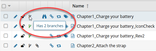
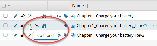
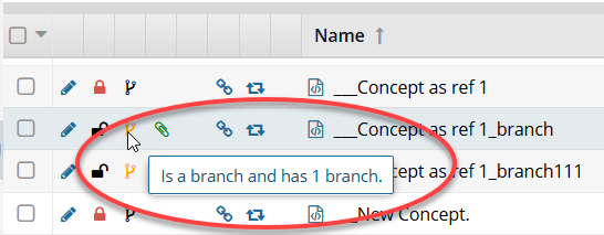
- Branch (, , ). The third column tells you that a copy of a component has been saved as a branch.
- Has a branch. This is the source component for a branch. Components it references may also be branched with it. When you hover your cursor over the black branch icon, you see a tooltip telling you it has a branch and also how many branches have been created from it. For example, Has 2 branches.
- Is a branch. This component was branched because a source component referenced it. When you hover your cursor over the green branch icon, you see a tooltip telling you it is part of a branch. For example, Is a branch.
- Has and is a branch. This component is both the source of one branch and included in another branch because a different source component referenced it. When you hover your cursor over the orange branch icon, you see a tooltip telling you it is part of a branch and also how many branches have been created from it. For example, Is a branch and has 1 branch.
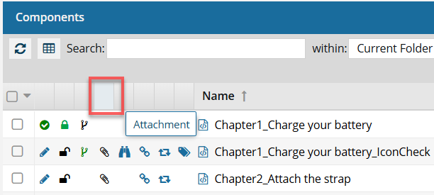
- Attachment ( , , ). The fourth column tells you if another component in Inspire is added as an attachment to this one by using the Component Details screen. This is useful if you want to attach a file for reference.
- Has an attachment. Has a relationship with another component in Inspire called an attachment. It lists a reference file that is added on the Component Details screen, on the Attachments tab.
- Is an attachment. Is related to another component in Inspire as an attachment. It is a reference file that is attached to another component.
- Has and is an attachment. Has the following relationships with another component:
- It lists a reference file that is added as an attachment
- It is listed by another component as an attachment
- Follow ( , ). The fifth column indicates whether you or another Inspire user has signed up to receive a notification when another user deletes or updates the component.
- Followed by you. Sends you a notification when another user deletes or updates a component.
- Followed by another Inspire user. Tells you that another user is following the component, but you aren't.
- Referenced ( ). The sixth column tells you the number of components that reference this component. To see the number, hover your cursor over the icon. A component is only counted once, even if it includes multiple references to this component.
- Shared (). The seventh column tells you the number of references in Inspire. To see the number, hover your cursor over the icon. All references are counted, even if one component references this component multiple times.
- Tags (). The eighth column indicates whether at least one component tag has been added to a component's Inspire-based metadata. To see a list of all tags applied, hover your cursor over the tag icon.
- File Type (,, ,,,). The icon shown immediately before the component Name indicates the type of content stored in the file or the application that created it.
- XML file (). A text-based data file written in Extensible Markup Language (XML) that contains custom tags to describe data rather than how it should look. You can edit this type of file in Inspire's Oxygen-based editor.
- Image file (). After you import an image, Inspire stores it in a binary format so that you can select it and insert it into your content. You can also attach it to other components, send it as a reference file for translation jobs, and manage it in the Components browser. However, because they are stored as a binary file, you can't edit the image in Inspire or Oxygen. For help using these files in Inspire, read: Work with images in Oxygen.
- Adobe PDF file (). After importing a PDF file into Inspire, you can reference it in the same way as you would an image. It's a binary file, so you can't edit it, but you can add it to a topic or map using Oxygen, attach it to other components, send it as a reference file for translation jobs, and manage it in the Components browser. For help using these files in Inspire, read: Work with PDFs.
- Microsoft Word file (
 ). You can import files with the .DOC and .DOCX extensions. In Inspire, these files are treated as binary, so you have limited options for viewing them and no options for editing them. You can attach it to other components, send it as a reference file for translation jobs, and manage it in the Components browser. For help using these files in Inspire, read: Working with DOCX files.
 - Microsoft Excel file (). After importing a file with an .XLS and .XLSX extension, you can reference it the same as you would an image. It's a binary file, so you can't edit it, but you can add it to a topic or map using Oxygen, attach it to other components, send it as a reference file for translation jobs, and manage it in the Components browser. For help using these files in Inspire, read: Working with XLSX files.
- ZIP archive file (). You can import a ZIP archive (or ZIP file) that bundles one or more files and folders into a single file. When you import an archive, you can choose to extract and save the files within it, or save the archive as a compressed file without extracting the individual files. If you choose to save the compressed file, it is stored as a binary file. In Inspire, a binary file can't be edited or extracted, but you can attach it to other components, send it as a reference file for translation jobs, and manage it in the Components browser. For help using these files in Inspire, read: Import a folder structure from the Components browser.
- XML file (
If you forget what an icon means, you can hover your cursor over a column heading to see a tooltip.